

This article first published in the September 2016 issue of PassageMaker Magazine.
It’s a dark and squally night in November 2014. Vestas Wind, one of the boats participating in the round-the-world Volvo Ocean Race, is romping along at 16 knots in the Indian Ocean. There is a loud crack—the daggerboard has sheared off. The boat pivots hard to port; the keel strikes the bottom and Vestas Wind is aground in 6-foot breaking seas on the Cargados Carajos shoals, 240 miles northeast of Mauritius in the Indian Ocean.
As waves wash over her, Vestas Wind pitches and rolls violently, and starts to break up, losing both rudders, the keel, and large sections of the hull. Water floods belowdecks and the ship’s lithium-ion batteries begin to smoke, threatening to go up in flames. In the early hours of the following morning, the crew scrambles off the back of the boat onto the sheltered side of the reef from where they are rescued later that day. All are safe and unharmed.
No one aboard was aware the reef existed, in spite of the fact that the area had been resurveyed from 2008 to 2010 by the Indian Hydrographic Office. The electronic charts in use were accurate and current, and a highly experienced navigator was in charge of route planning. So how could this happen? This accident dramatizes a fundamental weakness in many of the electronic charting systems in use on recreational boats. To understand it, we have to look at how charts are made.
The Chartmaking Process
Hydrographers take soundings by running straight lines and accurately positioning these and any submerged landmasses. In shallow and inshore waters these lines are closely spaced to ensure that no intervening features are missed. The deeper the water and the farther offshore, the survey lines get more widely spaced, because missing the features between them is less relevant.
Up until the widespread use of sidescan sonar (starting in the 1960s), there was little or no lateral vision when taking soundings, and prior to 1939, none at all, especially if the soundings were collected with a lead line. Prior to the advent of satellite navigation systems, the positioning accuracy used to plot soundings was significantly less than what any off-the-shelf GPS can deliver today. Over half of the soundings on current U.S. charts were collected using pre-sidescan-sonar and non-satellite-positioning techniques. In other parts of the world, it can be anything up to 100 percent (for example, much of the Pacific, Bahamas, and Caribbean; even substantial sections of the UK’s coastline).
Hydrographers typically conduct surveys at a larger, more detailed scale than those used to produce the charts derived from the survey. As many soundings as possible are collected and crammed onto the survey sheet, to the point that traditional, pre-digital survey sheets can be almost illegible. The cartographer has to reduce this mass of data to a legible level without losing the essentials.
For obvious reasons, the first priority of cartographers has always been to display areas of shallow water together with hazards, such as rocks and reefs. Large-scale charts that cover a small area in great detail have room to add plenty of soundings, such as narrow channels between shoal areas. Small-scale charts (covering a large area in little detail), on the other hand, do not have the space to legibly add fine detail once the low-water areas have been inked. As a result, the more you zoom out with paper charts, the larger the shallow-water areas get. There is absolutely no misunderstanding concerning hazards.
Where Did The Reef Go?
There are two types of electronic charts: raster and vector. A raster chart is an electronic photograph of a paper chart, so the same shallow-water features are reproduced: Shallow water is always clearly identified, regardless of scale. A vector chart is an entirely different animal. All of the data on the most detailed (largest scale) chart or survey sheet is captured in a database and is available to be displayed at any chart scale. When you zoom in, at some point you get all this information. When you zoom out, if this information were to be retained, the chart would rapidly become so cluttered that it would be unreadable. This is where the traditional cartographer removes detail to make the chart legible, preserving the shallow-water soundings. Reducing the clutter on vector charts is done in the software.
It is not uncommon for vector software to remove the shallow-water soundings. Given the zoom level at which the navigator aboard Vestas Wind planned his route, and at which the digital charts were being used while at sea, the reef simply disappeared from view. The shallowest water displayed was 130 feet. The navigator plotted a course directly across the reef. Had the navigator consulted a paper chart at any scale, the reef would have been clearly visible.
Note that most of the current crop of multifunction display devices (MGD) can now display worldwide raster charts in addition to vector charts, which was not possible in the past due to higher memory requirements of raster charts). While a benefit, raster charts often still don’t include access to important paper chart elements, such as the source map.
Mixed Messages
On a dark night in January 2013, the minesweeper USS Guardian powers at 7.5 knots directly onto the Tubbataha Reef in the Philippines in 4- to 6-foot seas. All efforts to free her fail. Later, in rising seas she swings broadside onto the reef, breaking her keel and punching numerous holes in her wooden hull. Waves sweep over the deck and drive her farther on, and she is at risk of breaking up. The crew is evacuated. Guardian is subsequently cut into three pieces, each small enough to be lifted off the reef by a giant salvage crane.
How could this happen on a navy vessel with its multiple navigational checks and balances, especially given the fact that the reef was clearly displayed more or less in its correct position on the small scale (general) vector chart? The problem here was the navy’s large-scale (coastal) vector chart had the reef 7½ miles out of position, based on erroneous satellite imagery. This had been known since 2011 but had not been corrected due to “human error.”
Guardian’s skipper and navigator noted the discrepancy between the small-scale and large-scale charts and simply assumed that the more detailed chart must also be the more accurate one to use. They relied exclusively on this and the ship’s GPS for navigation. Had they consulted paper charts or “Sailing Directions and Light Lists” carried on board, they would have found various mismatched coordinates, particularly for a light on a neighboring reef, which was clearly visible before Guardian grounded. These discrepancies would have sounded the alarm and indicated the inaccuracy of the coastal chart. The accident was entirely the result of over-reliance on the electronic chart.
After this expensive incident, the National Geospatial Agency (NGA), which is the exclusive supplier of digital charts to the U.S. Navy, reviewed other charts and in one case found the south coast of Chile to be 4.4 miles out of position.
Inaccurate Surveys
It is a dark night in January 2010 with the wind blowing 30 knots. The Cork Clipper, one of a fleet of round-the-world racing boats, is making 10 knots in moderately rough seas on a broad reach to the northeast, approaching the Gosong Mampango reef in Indonesia. The electronic chart shows a lighthouse and racon (radar beacon). The skipper has plotted a course to pass 0.6 miles southeast of the reef and then head up to the north, hard on the wind. Closing in on the reef, there is no sign of the light and the racon cannot be picked up on the radar. Around 0400 the electronic chart displays the Cork Clipper’s position as 0.63 miles to the southeast of the reef. The heading is altered to the north and almost immediately the Cork runs hard aground. Assuming the reef has been struck on its eastern edge, an attempt is made to turn to the east and sail off. This fails. During the rest of the night, Cork Clipper is battered by the seas and holed in several places.
Daylight reveals that the she is on the western side of the reef, not the eastern, and the attempts to get her off have only augmented her situation. There is little left of the lighthouse and racon on the reef—they have evidently not worked for many years. The crew, suffering only minor injuries, abandon ship and are picked up by other vessels in the racing fleet.
The paper charts for this region indicate that the data was mostly collected in 1867. There are various notes in the margins, such as:
CAUTION: SATELLITE-DERIVED POSITIONS
Positions obtained from satellite navigation systems, such as GPS, are normally referred to the WGS84 Datum. The differences between the satellite-derived positions and the positions on this chart cannot be determined; mariners are warned that these differences MAY BE SIGNIFICANT TO NAVIGATION and are therefore advised to use alternative sources of positional information, particularly when closing the shore or navigating in the vicinity of dangers.
None of these notes showed up on the electronic charts, although when zooming in and out, the position of the reef moved. The largest-scale paper chart available at the time (not carried aboard the Cork Clipper) had the following warning:
“POSITIONS: Gosong Mampango Lighthouse (3˚ 35’S, 109˚ 10’E approx.) and associated reefs Karang Batuan, Karang Sembar and Gosong Kelumpang, were reported to lie 0.9’ further east in 1992. Gosong Aling lighthouse (3˚ 31’S, 110˚ 11’E approx.) and the associated reefs were reported to lie up to 2 miles further east-northeast.”
Particularly disturbing about this incident is that it had clearly been known for some time that the reef might be out of position, but this was in no way reflected on the electronic charts. Even worse, despite this high-profile loss, when last I checked (in 2014) the electronic charts had not been corrected or modified in any way.
Human Digitizing Error
Readers may think, “Well, this is Indonesia and I will never cruise there, so this is not particularly relevant to me.” And indeed, the kind of gross charting errors found by Guardian and Cork in remote waters will never be found by most of us. Lesser errors, however, are commonplace in many popular cruising grounds. I have cruised extensively in the Bahamas and the western Caribbean, including Mexico’s Yucatan coast, Belize, Guatemala and Honduras and, although the position of landmasses on charts has been corrected through satellite imagery, almost all of the sounding data comes from the nineteenth century, including numerous depth and positioning errors.
Bringing this closer to my home waters, this past summer we cruised down the west coast of Ireland. On several occasions when transiting channels into and out of harbors and rivers, the GPS and latest generation of electronic charts placed us outside the channels, and sometimes on dry land.
Many paper charts have a source diagram—a small inset chart, broken up into regions—that covers the entire area of the chart. A table gives the date on which the survey data was collected for each region, together with the scale at which it was collected. The more recent the survey, and the larger the scale and more detailed the survey, the more accurate the data is likely to be. This information provides useful clues as to the reliability of the data, but is not reproduced on vector-type electronic charts and may be hard to find on raster charts.
Although NOAA is currently addressing this issue by adding Zone of Confidence (ZOC) data (similar to a source diagram) to its electronic charts, it will be some time before all charts are covered and in any case this only applies to the United States (visit: www.tinyurl.com/zoneofconfidence for more info).
Aside from surveying errors, which are carried over onto paper charts and all forms of electronic charts, other forms of lesser errors are commonplace on vector charts and unique to them. Take a raster chart of some location (or the paper chart from which it is derived), and then place a vector chart of the same location at the same scale alongside it. Look closely at the soundings and you may see minor differences in the placement of soundings. This is because the vectorization process requires a mechanism to convert all the data on a paper chart into a database format. Typically, a raster image is made of the chart and displayed on a screen; once that happens, some of the vectorization processes can be automated (for example, there is line-tracing technology that can automatically outline landmasses) but much of it still requires human intervention.
Soundings, for example, are commonly vectorized by having an operator mouse-click on top of the raster image of a sounding to determine its position, with the depth and any other key information also entered into a table. This clearly has the possibility of sloppy positioning and incorrect data entry, both of which occur. Another area where I have seen frequent errors on vector charts is in the use of rock symbols, with a failure to correctly use the submerged, awash, and drying symbols.
Chart Datums
Rewind again, back to January 2005. USS San Francisco, a $1-billion nuclear fast-attack submarine running at a depth of 525 feet between the Caroline Islands in the Pacific Ocean at over 30 knots, slams into an underwater mountain. The entire bow is crushed. Two-thirds of the crew are injured, and one would eventually die. With the forward ballast tanks destroyed, it is dubious whether or not the sub can resurface. In the event, after a nerve-wracking wait, the after ballast tanks prove barely sufficient to get the sub to surface.
The underwater mountain did not appear on the electronic charts in use, which displayed depths of 5,000 feet, although paper charts on board noted an area of discolored water that a subsequent navy investigation decided should have set off alarm bells. This region of the world has hardly been resurveyed since Captain Cook’s 18th century explorations. Because of the generally great depths of the ocean, survey lines can be many miles apart, missing massive details in between.
These sorts of things don’t just happen in remote corners of the world. In 1992 the Queen Elizabeth II (QE2) cruise ship, at that time the flagship of the Cunard Line carrying over 2,800 passengers and crew, struck an uncharted ledge off Cuttyhunk Island in Rhode Island Sound when traveling at 24 knots. A long gash was cut in the ship’s starboard side. The QE2, with a draft of 32 feet, was sailing in waters charted to a depth of 40 feet. The ledge fell in between survey lines.
A couple of other factors may have been at work in the QE2 grounding. We have a serious anomaly on all U.S. charts (paper and electronic). The displayed soundings are based on something known as Mean Lower Low Water (MLLW). This does not equate with extreme low-water events, such as those that occur during spring tides. The water level can, on occasion, be significantly less than the charted depth, sometimes by several feet. Most of the rest of the world uses a more conservative low-water chart datum, known as Lowest Astronomical Tide, or LAT, so this problem does not occur. Many U.S. paper charts have a table somewhere on the chart that has an Extreme Low Water column that informs you by how much the water level can go below the charted depth. These tables do not show up on vector-type electronic charts, and are likely to be hard to find on raster charts.
The other circumstance that may have been relevant in the QE2 grounding is the fact that when you power a boat with little water beneath the keel, the propeller tends to suck the water out from under her, lowering the boat relative to the surrounding water. This is known as squatting, and if the clearance beneath the keel is small enough, you can suck out the water until you are dragging the bottom, at which point the faster you try to go the more you drag, and the slower you actually go. We learned this long ago when we built and lived on canal boats in the U.K.’s shallow inland waterways.
We experienced the squatting effect dramatically one night when heading up the Mississippi Gulf Outlet Canal (now closed, because of the disastrous role it played in the flooding of New Orleans during hurricane Katrina). A fully loaded container ship passed us dragging the bottom and moving just fast enough to maintain steerageway. We edged over to the side of the channel to get out of the way. As the ship came past it sucked the water out of the channel leaving us temporarily hard aground and heeled way over.
My Navigational Nemesis
It’s the summer of 2003, the sun is shining and a fresh breeze is blowing—a great day for a cruise. My neighbor has just bought a catamaran. He calls: “Nigel, let’s go boating.” I am working on the page proofs of a new book called How to Read a Nautical Chart (published by McGraw-Hill and now in its second edition).
“I’m sorry Mike, I can’t. I have to finish these page proofs.”
His swift reply, “Bring them with you.”
So here I am, at the wheel of Mike’s brand-new pride and joy, reading the page proofs of How to Read a Nautical Chart, when I run his boat onto a rock at 7 knots. We are both thrown across the boat. Subsequent investigation reveals a crushed keel.
The fault here? Mike did not have an electronic charting system on board so we were using paper charts. The first time I had sailed these Maine waters (years before) I had made a mental note that if I stayed outside of a line between Haddock Island and Western Egg Rock, I would clear the rock with room to spare. Subsequently, I did not bother to look at the chart, which was unfortunate, because I had memorized the rock on the wrong side of the line. For years I had sailed over this same rock and never struck it because the tide had been high enough to clear it. On this day, we caught it at low tide. In all likelihood, if we had electronic charts onboard and displayed at the helm, we likely would not have run aground.
My point here is that ultimately, most groundings are the result of human error rather than chart error.
My Route Planning Process
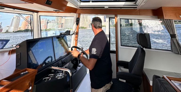
Like most recreational navigators today, to avoid the kinds of mishaps illustrated above, I now rely heavily on electronic charts both for route planning and for navigation. There are numerous benefits as compared to paper charts, including real-time display of the boat’s position (typically to a greater degree of precision than the display of the chart data) without the possibility of navigator error, overlaid AIS and radar displays, and various “added value” features, such as the ability to pull up instant tide tables. I have evolved a set of processes to minimize the associated risks.
We always carry paper charts, typically at a scale of somewhere between 1:80,000 and 1:150,000. This is not detailed enough for difficult harbor entries, but is good enough for most other navigational purposes and as a back-up to the electronic charts without breaking the bank. It also ensures that all shallow-water areas are clearly displayed and gives me additional data, such as notes and source diagrams that are unlikely to show up on the electronic charts.
Because of the relatively small size of even the largest electronic chart display as compared to a paper chart, and also the fact that the screen resolution on electronic displays requires you to zoom in to some extent to make any chart legible, further reducing the coverage area, I do my initial route planning for all but short and uncomplicated passages on the paper charts. This determines whether or not I have a relatively straight shot between the departure and arrival points. Let’s assume it is a straight shot.
I zoom out the electronic chart until I have my two waypoints, and then I lay down a track between them. Then I zoom in and look for hazards and other features that might require an adjustment to the track, scrolling from one end of the track to the other, moving the track and adding waypoints as necessary. The final step is to zoom in to the level at which all available data is displayed. I scroll along the entire track once more, rechecking all the soundings and other features along the track and in its vicinity. I make adjustments as necessary, highlighting potential dangers, and reviewing alternative tracks (which I often add to the chart) and emergency anchorages in case conditions change. This route becomes our primary navigational tool.
There are increasingly sophisticated software packages that automatically perform many of the functions just described, with Navionics’ Dock-to-dock Autorouting being the best-developed at this time. The Coastal Explorer PC charting program has a route-checking function that’s similar to my suggested routine, highlighting areas of possible concern and making it easy to zoom in to investigate further. This can be done on electronic raster charts, at least for the U.S. The software also has the ability to “unquilt” the raster charts such that a user can see all the other information printed on the original chart.
Regardless of the level of sophistication available to me, I would always perform the final step of zooming in to the most detailed data level available and scrolling along the entire route to look for adjacent hazards. The software does not provide this lateral vision.
At sea, we use the autopilot much of the time, but we never connect it to the chartplotter. I extract a bearing to the next waypoint from the chartplotter and plug this into the autopilot. This way, the crew also has to stay alert and we immediately become aware of currents and other factors setting us off the track and can decide what to do about it, as opposed to having the autopilot correct for these factors. We maintain a written position log at least once an hour so that if the electronic charts crash we have a recent fix from which to begin a dead reckoning plot on the paper chart. Included on this log are the range and bearing to the waypoint and the cross-track error, which provide the necessary information to determine tidal and other influences.
If it becomes necessary to switch to paper charts, I have the skills to use parallel rules and other conventional plotting devices. We rely heavily on visual navigation in narrow channels and when close to any hazards. We have hand-bearing compasses and know how to fix positions with crossed bearings, transits, and so on.
ECDIS versus ECS
Unlike us, many big ships no longer carry paper charts. For years it has been legal for them to rely on vector-type electronic charts, but they must be official electronic nautical charts (ENCs) issued by a national hydrographic office and displayed on a type-approved electronic chart display and information system (ECDIS). The latter, in particular, has to comply with rigorous standards, one of which defines essential data that must be displayed at any zoom level, including shallow water soundings and hazards. Ships must carry a fully functional and independent backup system (which can be another ECDIS or traditional paper charts). This level of technology removes many of the problems with electronic charts that I have identified but is prohibitively expensive for recreational boaters and requires a lot of real estate in the navigation station.
An alternative, less rigorous standard to ECDIS has been developed by the Radio Technical Commission for Maritime Services (RTCM). This defines operational and performance requirements for electronic charting systems (ECS) other than ECDIS. It defines four categories of equipment—A, B, C, and D—with category A being the most stringently tested and functionally not significantly different from ECDIS. It can be used as the backup system. In February 2016, the U.S. Coast Guard recognized a RTCM Class A ECS displaying ENCs as functionally equivalent to ECDIS, and an RTCM Class B or C ECS as meeting the charting requirements for commercial shipping operating out to the 12-mile limit (i.e. there is no need to carry paper charts). An RTCM Class D ECS is not considered an adequate substitute for paper charts.
The RTCM hardware requirements cannot be met by a typical personal computer or tablet because they do not meet the rigorous salt spray, vibration, heat and humidity tests, rendering most PC-based recreational electronic charting systems unlikely to comply with ECS.
However, for most of us using PC-based electronic charts, we have learned to live with our hardware weaknesses and it is the software side of things that primarily need improvement. There is another international standard that applies here, which is ISO 19379.
Over the coming years when choosing electronic charts and their associated display systems, compliance with the software provisions of RTCM Class A, B or C, and/or compliance with ISO 19379, will be a useful measure of the quality of the software.
It Pays to be Cautious
Almost all electronic charts used in the recreational boating have some kind of a legal disclaimer, such as the following from Jeppesen/C-Map: “Unless otherwise specified by national maritime authorities, the data licensed hereunder is inadequate as a primary means of navigation, and should be used only as a supplement to official government charts and traditional navigation methods.”
Whereas this disclaimer is probably there for liability reasons, it should not be ignored. For all their obvious benefits, electronic charts found in the recreational world have significant weaknesses with the as compared to paper charts and other sources of information.
To quote the investigation into the grounding of the Vestas Wind: “Unfortunately, the attractive presentation of electronic data creates a misplaced air of confidence in the accuracy of what is presented. There can be a false sense of security and a belief that further checks are not necessary. This can be a mistake.”
Until ECDIS and ECS Class A hardware and charts filter down into the recreational marketplace, there will continue to be a need for paper and traditional piloting techniques in the navigational toolbox.
Special thanks to PassageMaker’s Electronics Editor, Ben Ellison, for his assistance with this article.